
Art Direction & Photography
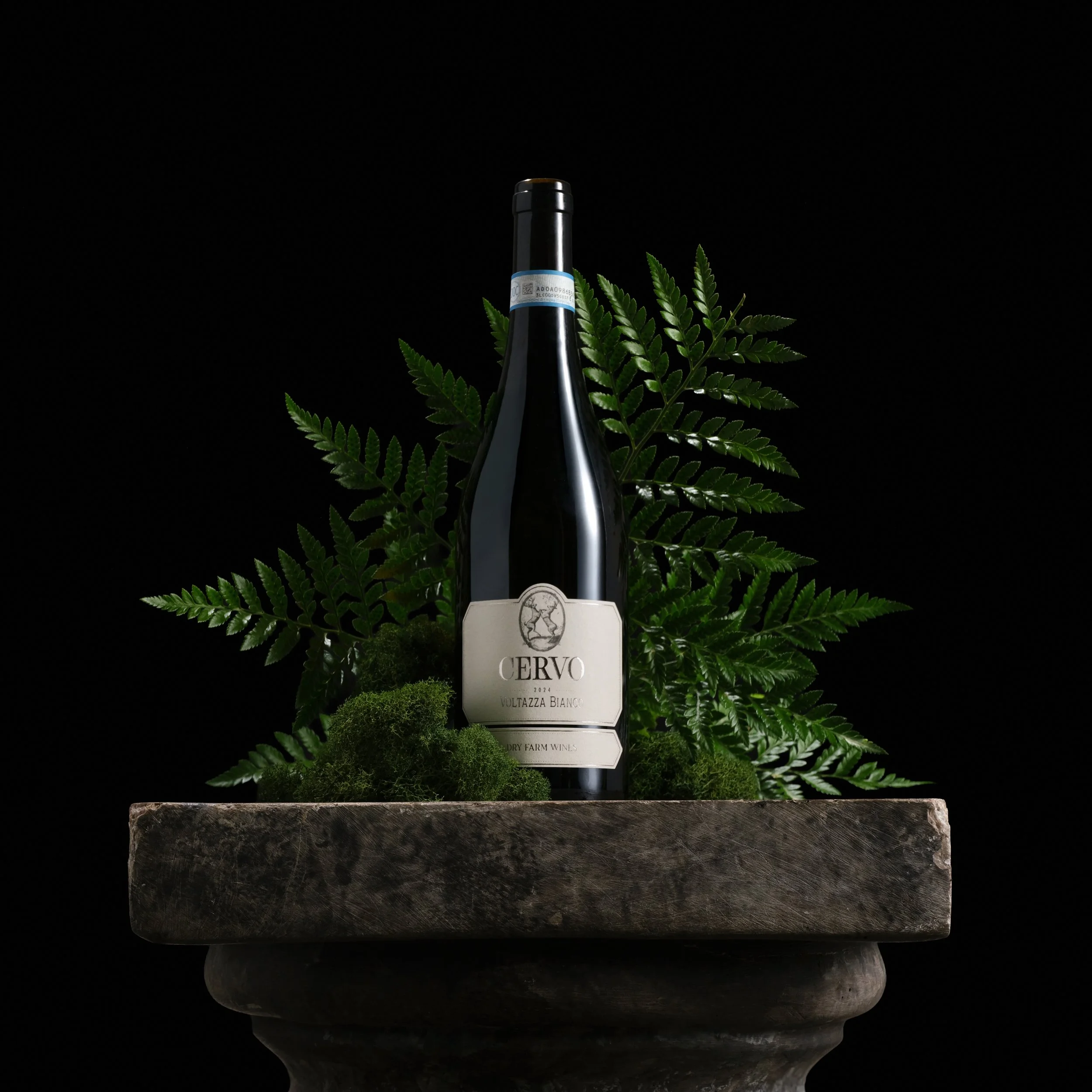
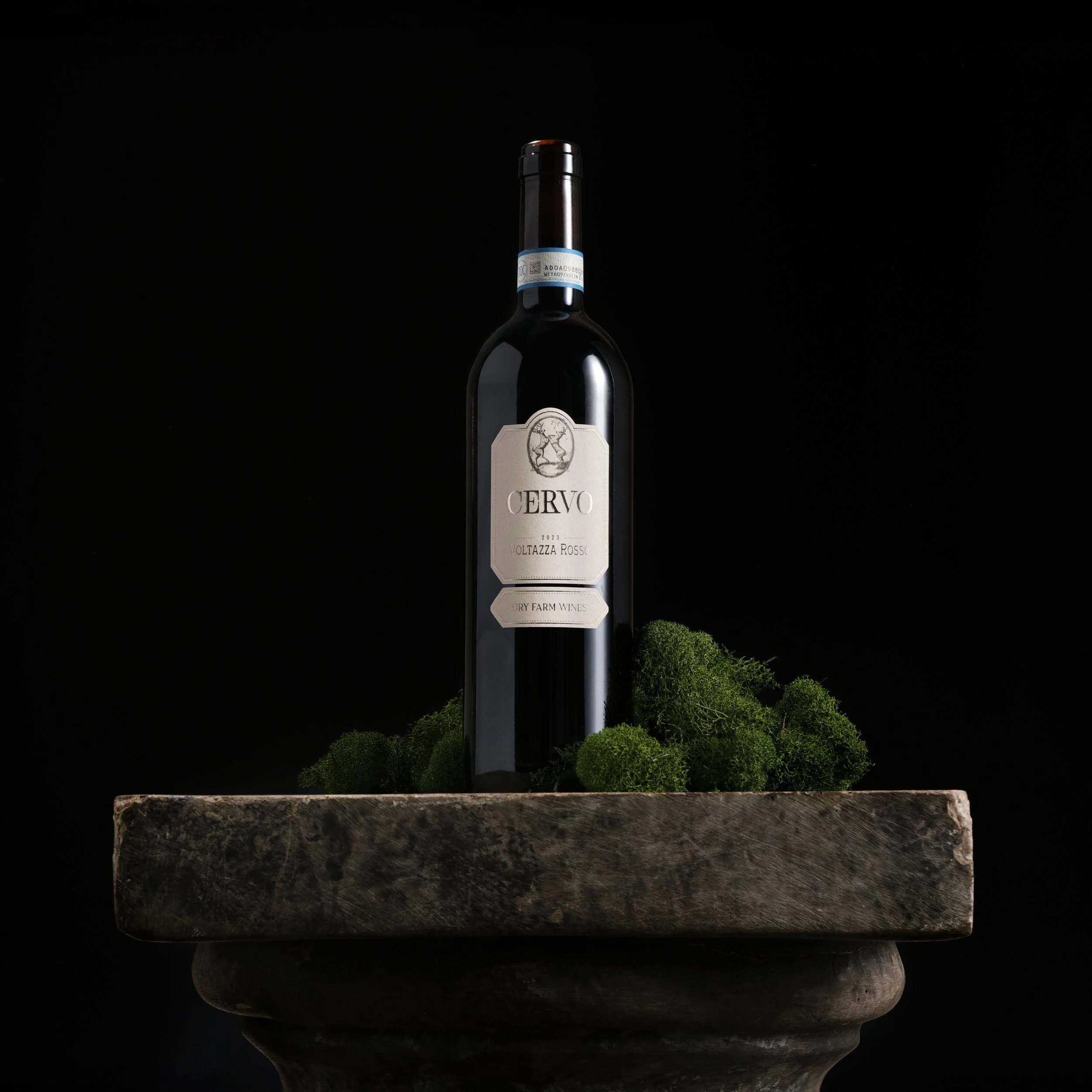
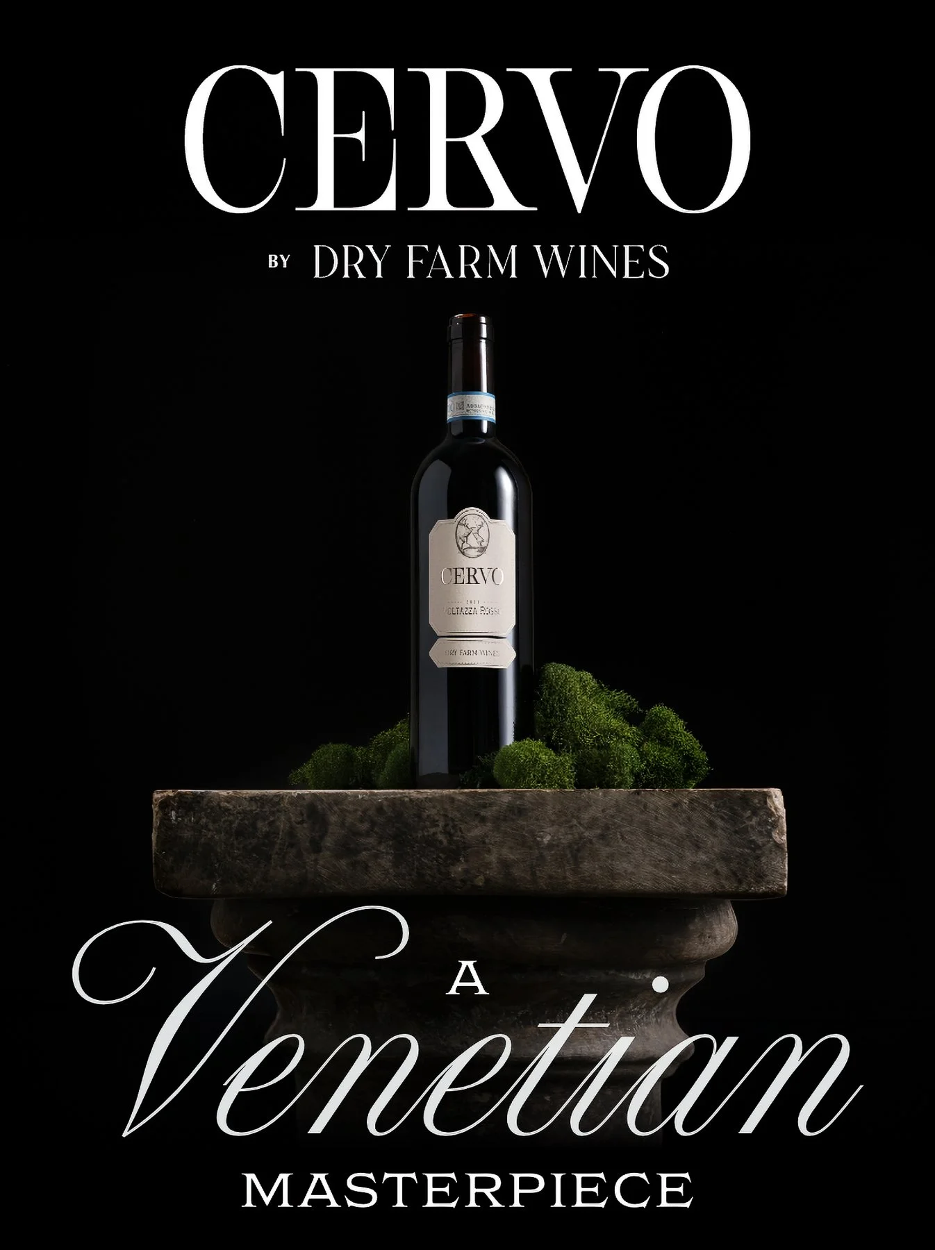
Created for the launch of Cervo, the campaign set out to establish a distinct visual identity for an Italian wine without relying on familiar Italian tropes. The goal was to reference its origins in a subtle way while presenting the wine with a sense of importance.
Concept
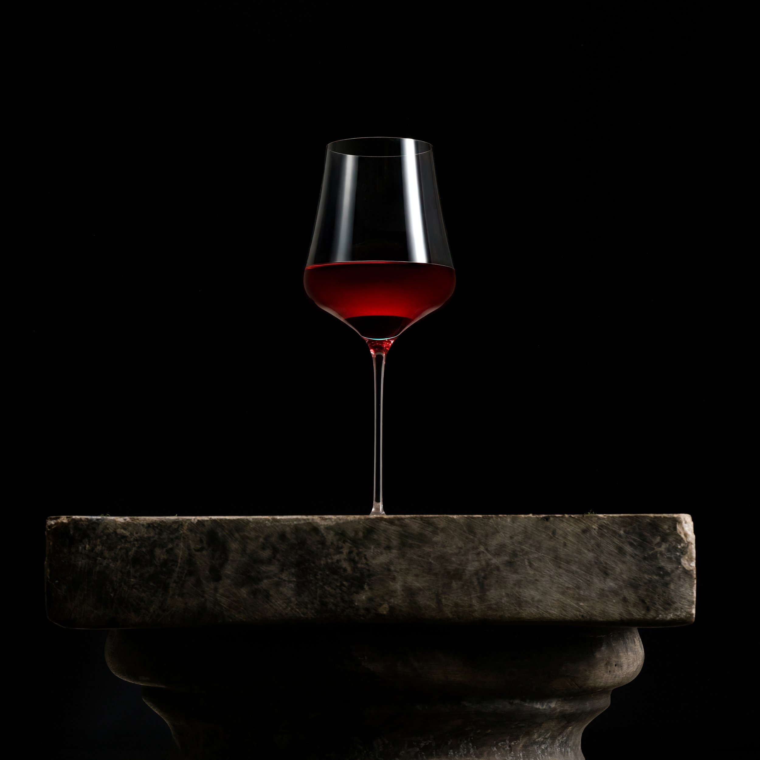
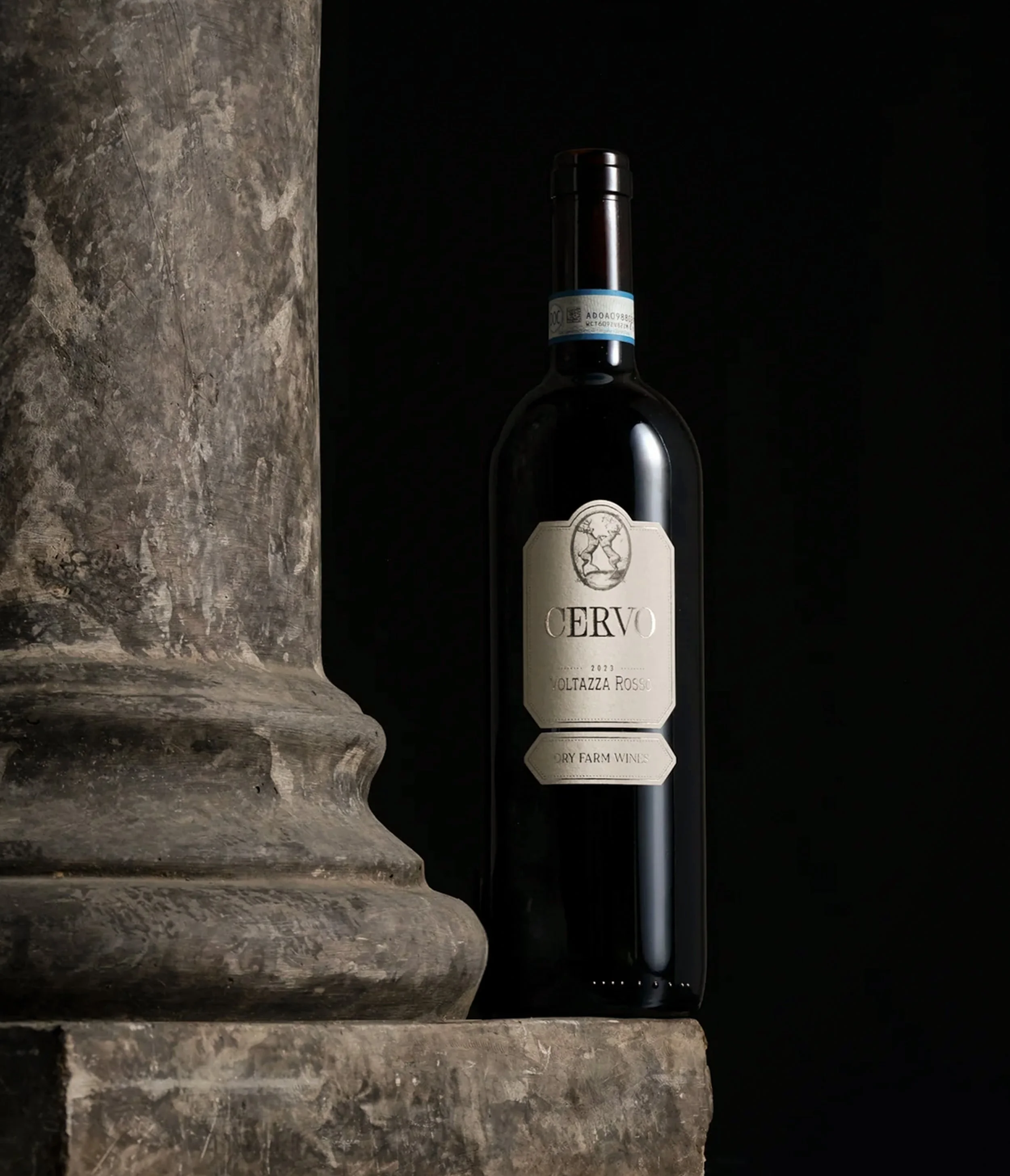
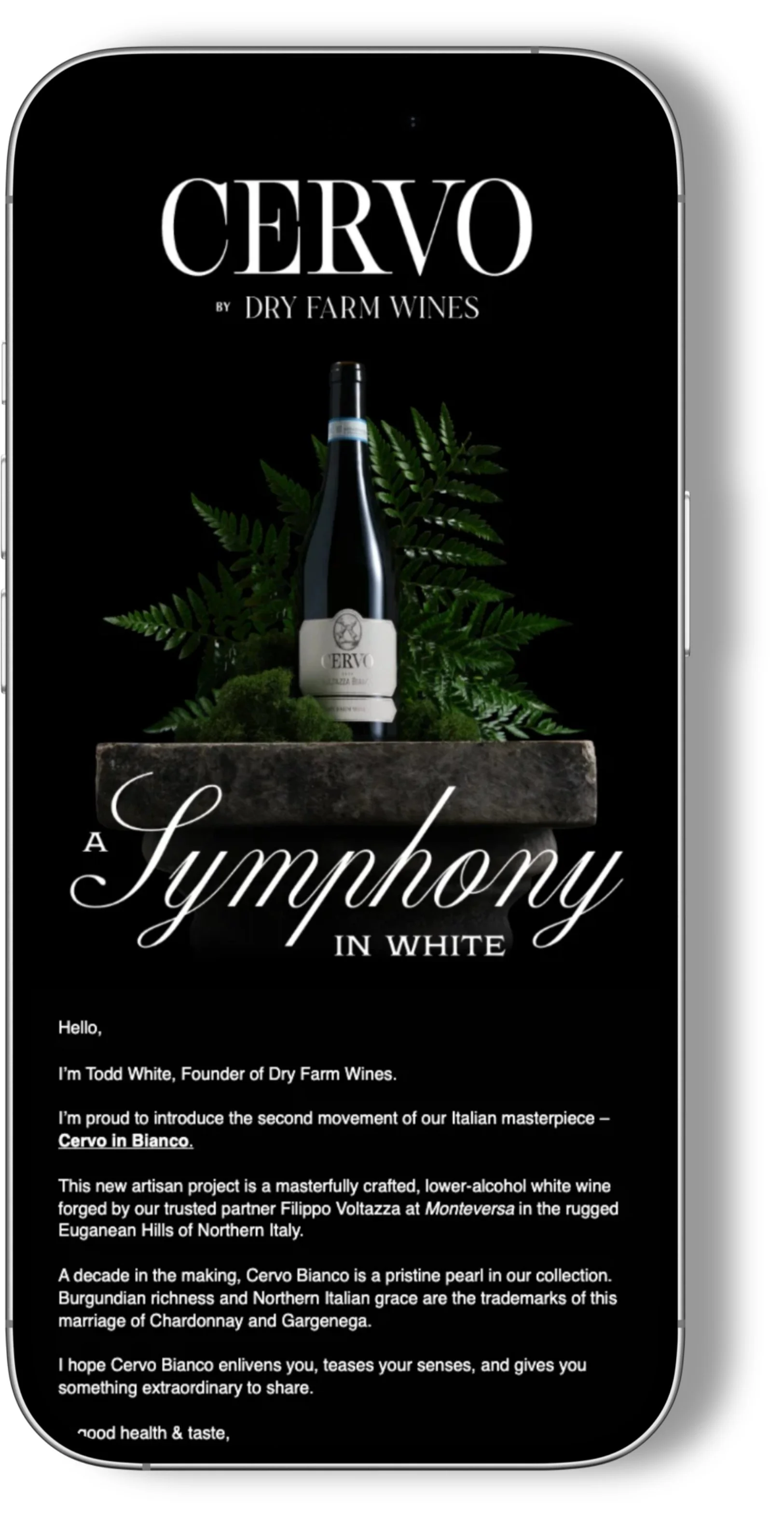
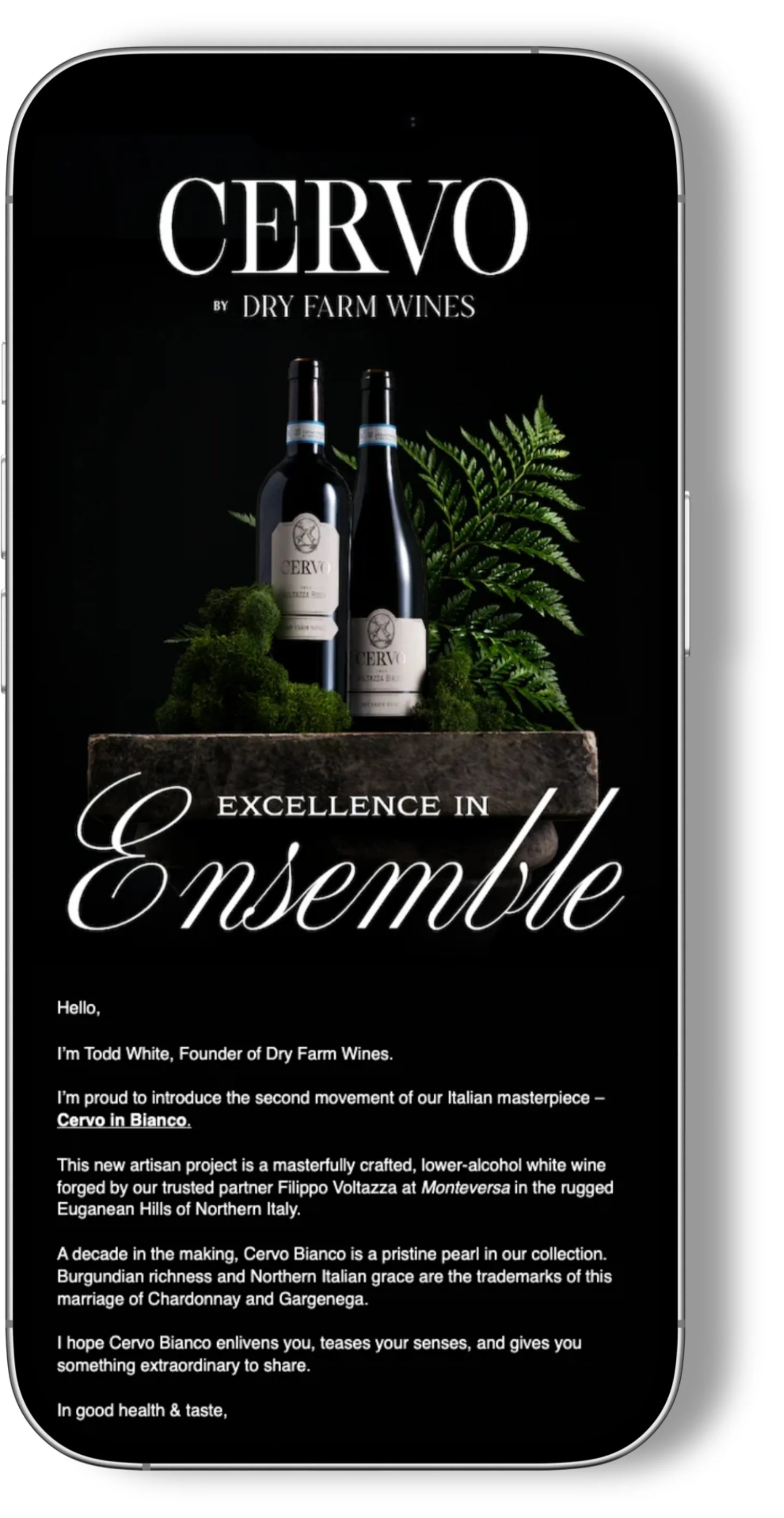
Stone pedestals became the foundation of the campaign, presenting each bottle with the same sense of permanence often reserved for sculpture. Moss, ferns, and weathered stone referenced the quiet atmosphere of historic Italian gardens, making the bottles feel as though they belonged within the landscape while maintaining a contemporary sense of luxury.
Impact
The campaign introduced Cervo through a distinct visual identity used across the website, email campaigns, digital marketing, and social media. The imagery established a visual foundation for the brand while differentiating it from Dry Farm Wines' existing portfolio.
Credits
Graphic Design: Scott Talian
Copy: Dry Farm Wines Creative Team